Tag: UX
November 19, 2011
-

You Are A User
There is an old saying, meant to shame those of us working on websites into acknowledging that we really don’t care about other human beings.
This raises the question of what the appropriate collective noun is for a group of people who visit and interact with a website. If not “Users” then what?
The most common alternative to “Users” is “Visitor”. That’s a bit more promising as to be at your site they had to visit it in a metaphorical sense, but “Visitors” is, for me at least, too passive. It has a “take it or leave it” feel to it. Is someone who relies on your site as a part of their life and who might use it multiple times a day really a “visitor”? This to me diminishes the importance of the person using your site.
I want to think of you as much more than a passing ship in the night, so I reject visitors for general use.
The saying suggests we call them “Customers”, but this seems problematic to me for two reasons.
Many people using websites aren’t actually customers. Most sites aren’t even looking for customers. You are not a customer of my blog for example. Calling people who visit my blog “Customers” just seems wrong. Even if you do have paying customers, you still have to build your site to deal with non-customers such as prospective customers, job hunters, or teens looking to a school report on your industry.
I therefore reject “Customers” as too narrow a view of who might use your site.
Interestingly enough I also reject “Customers” as too broad.
There is a movement to replace “Consumers” and “Users” with “Customers”. But people aren’t generally “Customers” except in the context of a commercial interaction. Yes I accept that my Acura dealer thinks of me as their customer and I appreciate them treating me well as their customer. But after the few days of interaction with them as a customer, what I really want is a car that is designed for “Drivers”. You might be a customer of Williams-Sonoma but you are a “Baker”. You are Amazon’s customer but you are a “Reader”.
If I was designing the Acura or Williams-Sonoma sites I’d definitely want my team thinking about Customer Experience, but I’d also want them very aware that the people using the site are Drivers and Bakers.
So what do people do on a site. They use it. The person using your site might be a a baker, or a driver, or a student, or a job hunter or they may idly followed a link to you and think of themselves as just visiting. But the common thread is that they are at your site, and they are using your site.
To me, User is to Web Site as Driver is to Car. As Reader is to Book.
So for me, “User” is the perfect word for what we are on the web.
February 18, 2007
-
Great Sign-up Forms Are Hard To Find
I recently signed up for a very interesting new online photo service called Picnik. The site is definitely worth a look — particularly if you are a Flickr fan like I am — but even if you don’t want to explore, take a gander at this lovely sign-up page:
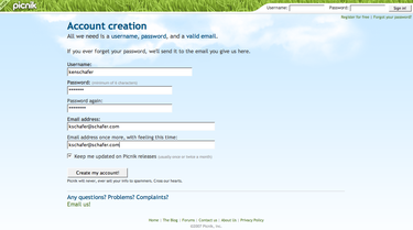
I love the simplicity of it and the way they’ve kept the voice of the site consistent and appealing.
Originally published at www.onedegree.ca on February 18, 2007.
February 1, 2006
-
Building Trust — Explain How You Make Money
Best Practice: Explain how your site makes money, or how and why it is funded if this is not apparent. This adds to the site’s credibility and overcomes fears that the site may be a scam of some sort.
Rationale: Not all sites are what they appear to be and people are becoming wary of new sites as an increasing number of online scam stories are covered in the media and passed around as an urban myth. People are taught (rightly) that “if it is too good to be true, it is”. This has implications for legitimate corporate websites and web-based applications (Web 2.0 take note).
Many new users, particularly those not familiar with your brand offline, will be very skeptical of your motivations until they get a sense that they can trust you. Design, ease of use, trustmarks, and real-world contact information all contribute to trust. But if people coming to your site cannot determine how you make money or why you built the site, they are likely to assign nefarious goals and may be reluctant to use the site. If it is not clear how your site makes money or how you benefit from making the site available, it is advised that you provide an explanation.
Tip: Providing an explanation doesn’t mean linking to an essay justifying your site’s existence. Just adding “a free service to support users of our products” for example can ease concerns.
Best Practice in Action: Ta-da List by 37 signals offers a simple free service but explains why the service has no cost despite being ad-free. Well done!
Originally published at www.onedegree.ca on February 1, 2006.
December 8, 2005
-
Getting Clients Involved In “Less”
There is a growing movement towards “less design and more constraints” in designing for the web — much of it sparked by Jason Fried of 37 Signals. At last month’s Torcamp I had an interesting conversation with Jon Lax about this concept and how the biggest problem facing companies that want to adopt “less” as a design sensibility is client buy-in. Clients typically want more not less. When you’re paying for something the first reaction is that more is always better, but of course that isn’t the case.
Probably the most dangerous point in the process is when you unveil a mock-up or prototype to the client’s team. Invariably people will say they like it “but…” — and with that but we start getting a laundry list of enhancements. “Wouldn’t it be cool if…”, “I think a user might want to be able to…”, “I don’t see anything for User Group F, G, and H on the site, could we put in a new section…”. You know the drill. The same thing happens when teams brainstorm the next iteration of a site. We naturally default to adding rather than taking away. To focus people on “Less” instead of “More” I suggest that we switch the goals of unveilings and brainstorming.
Rather than saying “what’s missing”, “what next” or “what else can we do for people”, let’s try asking these questions:
- What can we take away without impacting the user experience?
- What words can we remove without looking meaning?
- What can we get our servers to do so that users don’t have to?
- What can we remember from visit to visit so users don’t have to repeat themselves?
- What processes can we reduce?
- Where can we user simpler language, plainer English, and a less formal voice?
- How can we make pages smaller so they load faster and require less scrolling?
- How can we anticipate what users will commonly want to do next and make that painfully obvious?
- Can we do this with fewer people, less time, less technology, less money, and less pre-planning?
- Can we create artificial constraints that will make us look for more elegant solutions?
If we set up our processes to reward these questions — if we encourage “less thinking” instead of “more thinking” we’ll all benefit. Have you had any success in convincing clients that simpler is better (but still worth paying for)?
Originally published at www.onedegree.ca on December 8, 2005.
December 2, 2005
-
Canada.com Redesigns Around Content Channels
If you’ve been to canada.com in the last few days, you’ll notice that Canwest’s flagship site has been given a makeover.
Earlier this week Chris Powell at Marketing Magazine posted a brief overview of the changes:
The revamped site–which draws content from 43 websites, including CanWest’s 11 daily newspapers, the Global and CHTelevision sites, and vertical sites including the recently relaunched driving.ca, remembering.ca and working.com–boasts a new look, greater navigability and new “targeted content channels” including travel, health, video and lifestyle. Additional content and features include event and restaurant listings, city guides, local shopping guides, telephone directories and maps. Canada.com has also partnered with what CanWest Interactive president Arturo Duran calls “tier-one companies” such as Expedia, Mapquest and Google on associated features like travel, maps and content and search-related advertising. CanWest says the revamped site will also give advertisers the ability to integrate their products and services “with the most relevant content environment that best reaches their target consumer.” The site also offers access to the latest digital technology, allowing participating advertisers to “leverage multiple rich media platforms” to carry their message. Current advertisers on canada.com include Saab, Dell and Rona.
It’s interesting to see this relaunch of the site that has three million unique visitors per month coming hot on the heels of the driving.ca launch and so close to the holidays. I know that tradition has it that e-commerce sites shouldn’t muck around with their sites after Thanksgiving, but maybe it’s okay for content sites to use this time from some end-of-year housekeeping and redecorating.
Originally published at www.onedegree.ca on December 2, 2005.
October 7, 2005
-
Clever Headlines Don’t Pay In A Web-centric World
This image is from a recent Globe And Mail article entitled (as you can see) Snow Storms The Big Apple. Now I’ll admit that this is damn clever copywriting. But as a headline for web-based content, this just doesn’t fly.
Why?
Well, if you read this out of context (just the headline and a link in an e-mail, search results, or a feed for example) it is really hard to pick up that it is an article about Canadian artist Michael Snow’s new Museum of Modern Art one-man show in New York City. So lots of people who might find this interesting will skip over it. Worse still, the headline might confuse search spiders (although the body of the article certainly has lots of relevant keywords that people might search for). And I guess there is a chance that people searching on snowstorms might also end up getting this article when it really isn’t a good result for them. Take a word of advice and go study what Nick Usborne preaches about online copywriting. And leave the clever puns for those poor folks stuck in print.
Originally published at www.onedegree.ca on October 7, 2005.
September 1, 2005
-
Gap.com Closed For Renovations
Unbelievable. I mean really unbelievable.
The Gap, Gap Kids, Baby Gap, Gap Maternity, Gap Body, and Old Navy web sites are offline and according to USA Today have been for a while now:
Hoping to minimize the customer inconvenience, Gap Inc. waited until after most back-to-school shopping had been finished before launching a “soup-to-nuts” overhaul of its major e-commerce sites, said company spokeswoman Kris Marubio. “We think this is going to make for a more compelling and exciting experience for shoppers,” Marubio said.
The San Francisco-based company isn’t disclosing when the sites will reopen. Instead, visitors are being asked to leave their e-mail addresses with Gap.com and Oldnavy.com so they can be informed when the sites are selling clothes again. “It’s major project for us so we know it’s going to take some time,” Marubio said. She warned the company may still have to fix some bugs even after the sites reopen.
The continuing closure of Gap.com and Oldnavy.com is likely to put another small dent in Gap Inc.’s sales, which have been sagging in recent months. The slump already has prompted management to lower its profit projections for this year. Gap.com and OldNavy.com each generated online sales of $236 million last year, accounting for 3% of Gap Inc.’s total revenue of $16.3 billion.
Oldnavy.com attracted 4.2 million visitors in July while Gap.com drew 2.6 million visitors, according to Nielsen/NetRatings, a research firm.
As Eric Peterson at Jupiter Research points out, they’re losing over a million dollars a day. And they can’t say when it will be open again! Haven’t they heard of a staging server? (Note that Banana Republic’s new site has reopened and gives a tour of new features at the site. One can only guess that similar features will be seen at the “Grand Reopening” of gap.com and oldnavy.com sometime this fall.)
Originally published at www.onedegree.ca on September 1, 2005.
December 27, 2004
-

Thought
“Raise a lot of money for me, I’ll give you good architecture. Raise even more money, I’ll make the architecture disappear.” MoMA’s architect Yoshio Taniguchi
(via kottke.org)
December 6, 2004
-
Thought
Kathleen Straub has written a nice overview of the difference between an Expert Review and User Testing called “Cleaning Up For The Housekeeper”.
The whole article is good, but here’s a key point she makes:
“Expert Review examines details of human computer interaction guided by basic research about how humans interpret, understand and interact with objects in the world. As such, Heuristic Review exploits our generic understanding of human cognition to identify design/presentation details that may facilitate or impede a user’s progress within a task. These include issues such as affordances (How obvious the right next-thing-to-do is.), consistency and the effectiveness of layout and color to guide the user experience.
Usability testing identifies gaps between the site model and representative user conceptual use model in the specific context of use. Meaningful usability testing means observing representative users doing things on the site. Users bring unique domain knowledge and experience to their user experience. Designers — even experts — don’t have the same perspective.”
The title comes from the distinction between “straightening” and “cleaning”. You don’t hire a “straightening lady” so you need to straighten first so she can do her job. In the same way, it makes sense to do an expert review first (to “straighten”) and then do usability testing (to “clean”).
December 5, 2004
-
Thought
So I was reading the current (December 2004) issue of Wired Magazine and I came across an interesting article called “Roads Gone Wild”. I planned on taking a bit of my Sunday morning to link to the article and comment on it.
But here is what I get when I go to the Wired site today:
<image missing>
I don’t think there is anything wrong with the magazine holding back the online version of an article for a few days, weeks, or even until the next issue is on the stands. They make money off the current newsstand edition so not posting online immediately makes sense.
But it would be nice if they put a dummy page up for each article they will post. In that way, I would already have a permalink to post now even if the article won’t be live for a while.
“Pointing To” things online and in the real world is becoming essential and I think we’ll see a trend over time to all media (and physical objects) becoming “pointable”.
December 4, 2004
-
Study Finds Patterns in Web Site User Motivations and Questions
David Poteet at Computerworld gives a nice overview of new research from UIE in his article “Study Finds Patterns in Web Site User Motivations and Questions”.
I’m working on a site redesign now where the audience is making a big life choice and the decision process can take a year or two before they finally decide to move forward. We’re grappling with how to help people make this decision but at the same time dissuade those that are not right for the program from getting too far down the path before they realize it’s not right for them. This article is going to prove very useful as we get into our next phase of development which is defining the content and how to structure it on the site.
-
Thought
November 29, 2004
-
Thought
Donald Norman posted an article called Ad-Hoc Personas & Empathetic Focus that includes some great examples of personas in action. Norman suggests that made up personas that ring true are better than none, even though Forrester Research disagrees with this approach.
I particularly liked this explanation of “Empathetic Focus” in site design:
“The purpose of the Persona, I believe, is to add empathetic focus to the design. Empathetic focus. By focus I mean that the design must be clean and coherent. It is not a collection of features added willy-nilly through the life-span of the product, even if each feature by itself makes sense. Rather it is having a clear image of what the product is meant to be — and what it is not meant to be — and rejecting features that do not fit, only accepting ones that do. By empathy, I mean an understanding of and identification with the user population, the better to ensure that they will be able to take advantage of the product, to use it readily and easily — not with frustration but with pleasure.”
September 8, 2004
-
Hard Disk Drive Emergencies And Customer Evangelism
I had the unfortunate luck to have my hard drive fail a few weeks ago. My back-up was about 8 days old but clients and Basecamp filled in most of the gaps.
I thought I was in good shape until I realized that the back-up of “My Pictures” had only five digital photos in it instead of the over 2,000 we’ve managed to take in the last two years. It seems that the last back-up had been too large for the drive and it gave up without copying the pictures.
Needless to say this is a disaster. Two years of my kids’ lives, once well documented, were now (literally) a memory. Recalling how I had inadvertently destroyed most of my own childhood pictures in Grade Three, I knew that these pictures were far more valuable than anything else on the disk. I knew that data recovery could be costly, but I also knew that in 20 years when the kids were grown we’d pay any price to have those memories back.
I therefore began the quest for a reputable data recovery service in Toronto and after some Googling found my new favourite company — ActionFront.
From the very first visit to their website to picking-up 2 DVD-ROMs with all our photos archived for safe-keeping, this has been an absolutely great experience.
ActionFront realizes that:
1. Their customers are almost guaranteed to be panicked and stressed when they first contact them.
2. The only people willing to use their service are those who know they have something valuable that is close to being lost.
3. At the same time, customers are feeling vulnerable. It would be really easy for someone to take advantage of you when you find yourself saying “I’d pay anything to have my data back”.
4. For most customers this will be the first time they’ve gone through this nasty experience and they’ll need hand-holding.
ActionFront worked incredibly well to address all these issues. Here are a few of the things I noticed that made me a customer evangelist for ActionFront.
1. ActionFront’s home page puts “Call 1–800–563–1167 for immediate assistance” front and centre. If you have a disaster you want to speak to a real person, not wade through a huge site.
2. The site does have lots of details if you want to understand your situation better. They offer lots of background on why they are the best, testimonials, etc. And they also offer specific information on types of drives, common points of failure and the complexity of the process.
3. They have an amazing pricing model. If they can’t get you the data you want, you don’t pay anything. They charge a higher price because of this but it makes the decision an easy one. They give you the quote and if the data is worth that much to you, you say “go for it”. If it isn’t, you get the disk back.
4. They responded immediately via e-mail and phone. Follow-up was incredibly professional and with a reassuring “doctorly” tone. Here’s part of an e-mail: “Here is the evaluation results and quote for this recovery case. Please take as long as you need to decide how you’d like to proceed. If you have any questions or concerns, don’t hesitate to give me a call. Keep in mind that this quote is based on a successful recovery of your critical data. If the recovery is not complete, the partial recovery results must be to your satisfaction or there is no charge.” and then a few e-mail messages later: “Here’s the list of recovered files. It is important to realize that this good list is what will be returned if this recovery is approved so please look through the list carefully to ensure that all of your critical files are present. If you feel this is a successful recovery, respond to this email and we’ll get started preparing this data for return.”
5. Their offices were clean, their staff professional. The clean-room was visible as you entered. In all, it seemed like this was the right place for my dead drive to be revived.
6. When I picked up the drive and recovered data it was packed in a custom shipping box with lots of foam and anti-static sleeves. And to seal my affection, it came with a booklet on how to prevent future disasters — essentially saying “we don’t ever want to see you again”.
Well done!
September 6, 2004
-
Thought
Jakob Nielsen’s “Preparing a Website for the Holiday Shopping Season” makes a great point that site architects often forget — with the rise of search as the dominant traffic generator on many sites, it is now possible for most of your traffic will not be coming through your home page and other key landing pages. That means that every page has to do double duty. First they must cover the topic under discussion so that you add enough value to get the search listing in the first pace and deliver the value the user was seeking. And secondly, pages must convey why your site is a trustworthy source and ask for the sale (whatever that may be).
As Jakob states: “A website is like a house with a thousand front doors: visitors can enter anywhere.”
July 31, 2004
-
HBX V2
I just posted this to Eric Petersen’s wonderful Web Metrics Discussion Group:
Subject: HBX V2
I’m delurking to point the list to the log-in for HBX which has this notice
(that I noticed for the first time today):
WebSideStory will soon release the latest version of its flagship service, HBX. Version 2 of HBX has been designed based on direct customer feedback.
Enhancements:
– ‘Tagless’ Campaigns: Create and manage campaigns directly from the user interface, with no change in your page tags. You can define campaign response, leads and conversions from the user interface, simplifying your campaign measurement activities.
– Conversion Rules: The conversion events introduced in HBX have been improved to include advanced rules such as conditional conversions and more.
– Conversion Groups: Group any number of conversion rules and get conversion-specific reports in HBX.
Add-ons:
Active Segmentation: Use this add-on module to create advanced filters on your visitor sessions. Examples of filters may include any combination of geographical, purchase or site behavior parameters. Active Segmentation lets you create advanced segments directly from the user interface, with no changes in your HBX page tags.
HBX v2 and Active Segmentation were developed to provide you greater control in improving your online business initiatives. We’ll keep you updated on the release schedule.
Is this the beginning of a new round of feature wars as we move into the fall? How do these new features fit into the picture presented by the NC article Eric recently linked to? Will HBX move into the lead or does Omniture have or plan to have similar features soon?
-
Thought
CIO Insight has a brief interview with Jakob Nielsen called Time for a Redesign.
“an average mid-size company can expect a return on investment of 1,000 percent, and a gain of $5 million a year in employee productivity, simply by improving the usability of its intranet.”
I’m just about to start on an intranet redesign project so this article was timely. In fact it probably would have made the case for me. Fortunately the company and their web agency were open minded enough to get me on board early on without needing a detailed cost-benefit analysis.
While I didn’t have Nielsen’s numbers at hand during the initial meeting, I did say something to the effect of “okay, you have over 10,000 employees, 70% of them access your intranet on a regular basis. That means at least 35,000 visits to the site we are redesigning each week, or 1.75 million visits a year. Let’s say that my work shaves only 3 minutes off each visit by reducing confusion and the time it takes to get to key tasks. That works out to over 10,000 staff days in savings. That’s the equivalent of 32 full time staff a year.”
I can’t imagine a more compelling argument for getting expert help in redesigning internal sites as well as customer facing ones.
July 30, 2004
-
Budgeting for Advertising and Customer Experience
Great column (as always) by Mark Hurst. This one, entitled Budgeting for Advertising and Customer Experience, deals with an all too common problem — companies that budget well for advertising to get people to their site but spend almost nothing to ensure that people can actually use the site once they get there.
I see this every day as I meet with companies to discuss their websites. Many of them have such underfunded and poorly thought out sites that they don’t even know what the potential is. I met with a major insurance company who was happy that five customers had signed up using their complex online quote and purchase process. Five! And that was a good day. My guess is the process that many customers a minute through call centers and sales agents. No wonder the CEO doesn’t want to spend more on web initiatives.
Of course, with a proper strategy, a well-designed site, and an integrated approach to marketing in and between multiple channels, I’m sure that the Web could be on an equal footing with the call center. But how to convince the CEO that a properly implemented web strategy and user experience would mean one hundred times the sales through the web channel? If you suggest that poor site design makes 500 potential sales per day into 5, who will ever believe you?
Still, I am encouraged, as Mark is, that some folks are starting to get the madness of this approach. Read the article and you too will be left shaking your head at the illogic of “business as usual”.
(And congrats to Good Experience for finally adopting a blog format and getting an RSS feed! Not sure when that happened but I just clued into it.)
July 28, 2004
-
Thought
Christina Wodtke and Nate Koechley delivered a very interesting presentation at webvisions 2004 conference in July.
Essentially they are suggesting a model whereby a lot of the IA (particularly wireframing) is done in a style that supports easy integration into a standards-based web design. One can imagine using divs & classes to define the structure of the page without needing to step into the “little box on the top right” kind of wireframe that really limits designers for no real reason.
I’ve been thinking a lot about this and I’m very interested in the idea of the XHTML almost being the wireframe for the site. “CSS Styling” is then the job of the designer. Replacing placeholder code with database and application hooks is the job of the developers. And the wireframe/XHTML is the site structure, page layout, and requirements documentation.
This is a big idea and I plan to work on this more.
If any designers with a passion for CSS want to discuss breaking up workflow between XHTML creation and CSS design, I’d like to hear from them.
July 22, 2004
-
Thought
Read and Pass is the blog for Seth Godin’s wonderful new project ChangeThis.
Funny though, the blog is in chronological order instead of the almost universal reverse chronological order.
I find it endlessly confusing that the posts are in the “wrong” order and I’d like them to change it right away. I can’t imagine I’m the only one who’s noticed this even though Feedster shows few links to Read and Pass.
So here is my first “minifesto”:
All blogs should be in reverse chronological order to avoid needless scrolling and to stick with conventional usage.
July 21, 2004
-
Jumping To Conclusions About White Space
The June 2004 issue of Usability News has an article called “Reading Online Text: A Comparison of Four White Space Layouts”.
The research is summarized as:
“In this study, reading performance with four white space layouts was compared. Margins surrounding the text and leading (space between lines) were manipulated to generate the four white space conditions. Results show that the use of margins affected both reading speed and comprehension in that participants read the Margin text slower, but comprehended more than the No Margin text. Participants were also generally more satisfied with the text with margins. Leading was not shown to impact reading performance but did influence overall user preference.”
I’ve looked at this a few times now and have to say I don’t get it. The sample images used in the testing seem to change the font size as well as the margin and leading. The images are the same width and each line has the same number of letters on it, but two of the images have almost no margin. Seems to me that this means the font has to be larger.
If this is the case, then the results don’t seem conclusive. In fact, in the report the researchers state:
“The second preferred combination was the No Margin, Optimal Leading condition. Interestingly, those that chose this condition as the best layout said that they liked the spacing between the lines and indicated the font looked larger and was easier to read. So, while leading did not affect reading performance, it did appear to influence user preference.”
Somehow the researchers manage to say “they liked the one that they thought had the bigger fonts, so the leading must have an impact on preference.”
I think the research makes could equally be read to say:
“The second preferred combination was the Larger Fonts, Optimal Leading condition. Interestingly, those that chose this condition as the best layout said that they liked the spacing between the lines and indicated the margins looked smaller and was easier to read.”
And therefore the whole exercise seems too ambiguous to draw a best practice from. And I was really hoping to add that one to the archive.
May 22, 2004
-
Making Einstein Simple
Jessie Scanlon has a great essay in the NYT on simplicity in design (“A Design Epiphany: Keep It Simple”) that includes this line that intrigued me:
“Make everything as simple as possible, but not simpler,” Albert Einstein is often quoted as saying. His actual wording was a tad more convoluted, but in any case, few in Silicon Valley heeded his advice.
A bit of Googling showed that indeed a lot of people like this quote and attribute it to Einstein. A bit more digging found more details on the attribution in a lengthy discussion of Occam’s Razor:
The pithiness of this quote disguises the fact that no one knows whether Einstein said it or not (this version comes from the Reader’s Digest, 1977). It may well be a precis of the last few pages of his ‘The Meaning of Relativity’ (5th edition), where he wrote about his unified field theory, saying ‘In my opinion the theory here is the logically simplest relativistic field theory that is at all possible. But this does not mean that nature might not obey a more complex theory. More complex theories have frequently been proposed. . . In my view, such more complicated systems and their combinations should be considered only if there exist physical-empirical reasons to do so.’
Funny that someone (probably Reader’s Digest) had to simplify the concept of not simplifying too much.
February 17, 2004
-
Thought
Wired News: Webmonkey, RIP: 1996–2004:
“They finally pulled the plug. Webmonkey, the site that turned humble Web developers into attention-grabbing authors, said last week it is closing down following a round of layoffs in the U.S. division of its parent company, Terra Lycos (also the parent company of Wired News). Judging by blog posts and e-mails, the site’s fans aren’t surprised. Still, they’re sad to see the end of an era.”
December 19, 2003
-
Separating Store From Products
Signal vs. Noise Weblog asks whether Separating Store From Products is the best strategy.
My guess (and this is a brand new thought) is that for some sites there are three modes for using the site — browse, search, and shop. This implies that you should be able to access the same information in all three modes. It might be that a “Store” is a way of looking at the information on the site rather than a separate place. I would argue that product pages without a “buy” button are impotent and should be avoided as they leave the potential customer without a way of reaching an obvious goal.
In this model, “store” might not be a product catalog per se, but rather a view of product lists enhanced by retail merchandizing, suggestive selling, etc.
Like I said, this is a brand new idea, but I’m warming to it already.
November 18, 2003
-
Thought
The Webby Business Awards winners for 2003 were announced today.
-
Thought
Kevin Werbach has an article on TheFeature called The Triumph of Good Enough. The article is about how the Treo 600 smartphone has made enough small changes to its design and functionality that Kevin has reassessed his doubts about the future of converged mobile devices.
The entire article is a good one for anyone who doubts that (as Kevin says) “Subtle improvements can have huge consequences.”
November 12, 2003
-
Thought
Dave Winer seems to be developing the new Scripting News site in real-time. The page is getting slowly modified as Dave blogs his progress and people comment on how he’s doing. Not something I’d recommend to the faint of heart, but interesting to watch.
Wonder when a nav bar will appear.
November 10, 2003
-
Thought
Jakob Nielsen provides his “Ten Most Violated Homepage Design Guidelines” and includes compliance ratings from the site’s his company has audited. He notes that his US$10,000 home page audits generally get large corporations and governments as customers, which biases the data slightly, but it is unlikely that smaller companies are fairing much better.
-
Internet Littered With Dead Web Sites
Yes, the Internet Is Littered With Dead Web Sites. In general it’s a good idea to keep all links on your site live so that bookmarks, external links, and search engine databases can find the content or be redirected to newer information. But what to do if the entire site is going to be adandoned?
Or you could leave it up for archival purposes. This is probably the best solution as there is a long-term issue with information that may have historic information disappearing. In “olden times” we could refer to people’s letters, diaries, and books to see what people in the past thought. With ephemeral electronic records much of what we rely on to decode the past will be gone. Archiving your site is less of an issue if the Internet Archive has already cached a copy of your site. In that case they are effectively hosting the archive of the site for you.
If maintaining the site as an archive is not an option, you may consider pointing all pages on the deceased site to one page that explains what happened and offers the reader suggestions on where to go for current information. If you have a site you can’t afford to host anymore, you could still maintain the domain for a few dollars a year and point the entire domain to a free/cheap page hosted elsewhere that explains the fate of the site.
If a site it to remain live after it is outdated, it is important to identify the new purpose of the site (historic archive) and to ensure that people know that your information may no longer be relevant. A “last updated” reference is particularly useful in this case.
(Thanks to Gerard Dolan for the link)
October 31, 2003
-
Thought
Metafilter: Where is Boing Boing?:
“We’re having server problems and working on them — I hope to be up in a day or so again, but it’s exacerbated by my crazy travel schedule.
Please direct your friends to this note, and ask for their forebearance in sending email asking what’s up with Boing Boing. I’m getting several hundred of these a day, and it’s gotten so that answering those messages is actively interfering with my efforts to reestablish service.
In the meantime, we’re still blogging, and the mailblog still works:
http://groups.yahoo.com/group/boingboing-mailblog/
posted by doctorow at 1:36 PM PST on October 30″